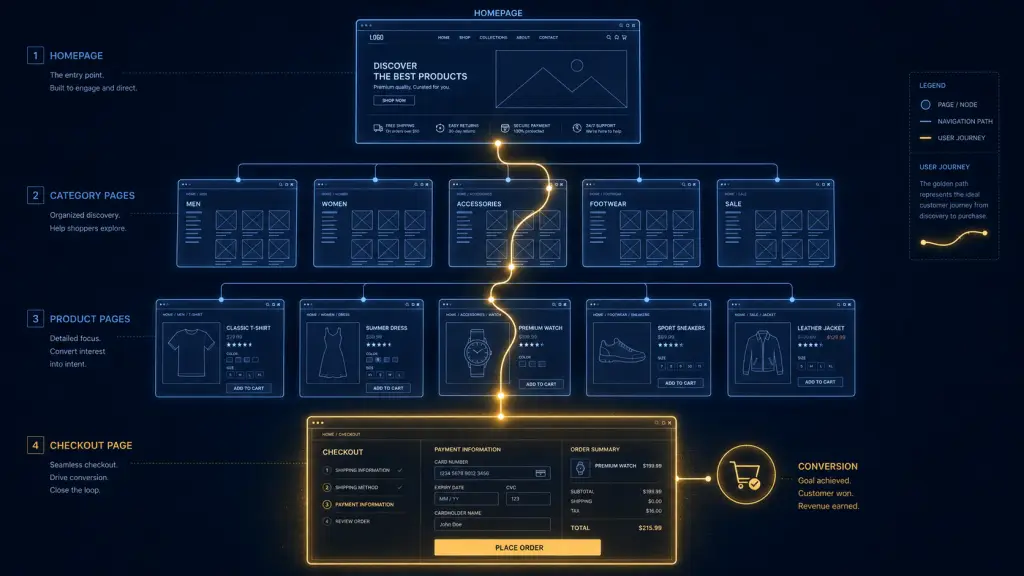
Your eCommerce site structure for conversions is everything. A logical information architecture, clean product page hierarchy design, smart navigation UX, and a mobile-first layout work together to pull shoppers from homepage to “Order Confirmed” with as little friction as possible. Nail these four pillars and your conversion rate will thank you.
Let me ask you something: have you ever walked into a badly organized store, couldn’t find what you wanted, and quietly walked right back out? That’s exactly what happens on a poorly structured eCommerce site except your shopper doesn’t even have to put on shoes to leave. One confused click and they’re gone.
The good news? eCommerce site structure for conversions is a solvable problem. And solving it doesn’t require a total redesign or a team of 12. It requires understanding how shoppers think, then building a path that matches that thinking.
Let’s dig in.
Why Information Architecture Is the Foundation of Your Online Store
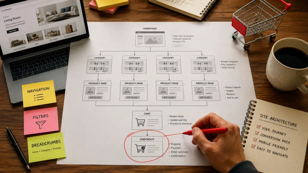
Think of your site’s information architecture (IA) as the floor plan of a physical store. If the shoes are next to the garden tools, nobody’s buying either.
An intuitive navigation structure, powered by robust search and faceted filtering, is the backbone of a user-friendly online store and this trio works together to create a clear pathway from the homepage to the exact product a customer wants, drastically reducing friction and frustration.
Some users prefer to browse through logical categories, others know exactly what they want and type it into a search bar, and many land on a category page and need to narrow down thousands of options. Excelling at all three ensures you cater to every type of shopper, guiding them efficiently toward a purchase.
When building your information architecture for your online store, start with customer behavior not your internal product catalog logic. How do *your* shoppers think about categories? What words do they use? Your IA should mirror their mental model, not your warehouse filing system.
Keep your category hierarchy within three levels structure category navigation so product groups remain within three hierarchical levels.
Deeper than that and you’re basically asking shoppers to spelunk through your site with a flashlight.
Product Page Hierarchy Design: Don’t Make Them Hunt
Here’s where a lot of stores quietly bleed revenue. The product page is your digital sales rep. If it’s disorganized, slow, or confusing, it’s a sales rep who forgets their pitch halfway through.
The path to products must be thoughtfully designed to convey differences among various product categories and among individual products, helping users locate the item best suited to their needs.
Structure Your Categories Like a Pro
There are two core hierarchy types: parent categories, which group subcategories under a shared descriptive name, and subcategories, which group specific products together like shoes, hats, or pants.
Here’s a pro tip I love: the ideal solution is to have unambiguous top-level categories, but this isn’t always possible. To avoid missing sales because visitors are looking for a product in the wrong section, consider having products and subcategories appear under multiple parent categories.
Yes, it’s a bit more work. Yes, it’s absolutely worth it.
Use Breadcrumbs They’re Not Just for Fairy Tales
Breadcrumb navigation shows users exactly where they are within the site hierarchy for example, “Home > Furniture > Sofas > Sectionals.” This reduces disorientation in deep product hierarchies, lowers bounce rates for users who land on product pages from search engines, and improves the overall sense of control users feel while browsing.
A well-structured hierarchy also helps search engines understand your eCommerce site. Clear category URLs and logical nesting make it easier for Google to index your products and for shoppers to arrive on the right page from organic search.
Navigation UX for Higher Sales: Fewer Clicks, More Conversions
I’ll keep this simple: the fewer clicks it takes to find a product, the higher the likelihood of a purchase.
Every extra click is a little exit door. Stop building exit doors.
Most people think of navigation as a UX concern. But the stores that take it seriously treat it as a revenue lever because every point of friction in the navigation path is a point where shoppers leave.
Keep Your Menu Lean and Scannable
Your main menu should contain no more than eight top-level items. When a user clicks on a top-level category, they should see their relevant subcategories immediately.
Research on cognitive load suggests seven items (plus or minus two) as the limit for what most people can process in a single glance.
So if your nav bar looks like a novel, it’s time to edit.
Stay away from long vertical dropdown menus that go below the fold. If a user has to scroll down to see your full navigation menu, it’s too long.
Build Navigation Loops, Not Dead Ends
Here’s a conversion insight that surprises a lot of store owners.
Building fluid navigation between products rather than isolated dead-end pages increases multi-product browsing and lifts conversions. Introducing a “Previous/Next” navigation loop between products alongside cross-sell suggestions turns isolated product pages into a continuous discovery path.
And the data backs it up beautifully.
Shoppers who viewed three or more products converted at 5.04% versus those who saw only one as a compelling reason to keep browsers moving.
Mobile-First eCommerce Layout: Design for the Thumb, Not the Mouse
Let me paint a picture. Your shopper is on the couch, phone in hand, casually browsing. They find your store. If your layout makes them pinch, zoom, or accidentally tap the wrong button three times… they’re back on Instagram in seconds.
With mobile commerce exceeding 50% of transactions, prioritizing the mobile experience is no longer optional mobile-first design and responsive web development are crucial for capturing this growing market segment.
A well-executed mobile-first layout improves SEO, increases conversion rates, and reduces bounce rates.
That’s three wins from one smart design decision. I’ll take that trade every single time.
Speed Is a Structural Decision
Your mobile-first eCommerce layout lives or dies by speed.
Slow pages cost sales directly. Reducing load time by one second boosts mobile conversions by 3%, while pages that take longer than four seconds to load have a 63% bounce rate.
Google’s mobile-first indexing means that poor mobile navigation, which affects 44.6% of US eCommerce traffic, can directly suppress organic rankings.
So slow mobile nav doesn’t just lose sales it loses search visibility too. Ouch.
Streamline the Checkout: Don’t Fumble the Final Yard
You’ve built a beautiful structure. The shopper navigated confidently, found their product, and added it to the cart. And then… a clunky checkout loses them. That’s like sprinting a marathon and tripping six feet from the finish line.
Baymard Institute research puts the average cart abandonment rate at 70.22%, and large eCommerce sites could recover up to 35% of those lost orders through better checkout design alone.
With the average cart abandonment rate hovering around 70%, optimizing the checkout process is critical. A streamlined checkout minimizes friction, encouraging customers to complete their purchases and this means simplifying forms, offering guest checkout options, and providing multiple payment methods.
Your checkout is the final chapter. Make it short, make it clear, and for the love of conversions offer guest checkout.
Putting It All Together: Your Conversion-Ready Site Structure
Think of your eCommerce site like a well-designed airport.
The most successful eCommerce websites seamlessly integrate visual appeal with practical functionality, creating experiences that customers enjoy while effectively driving business results.
Here’s the simple framework I’d suggest:
Homepage → clear category navigation (max 7–8 items) → Category pages → subcategory filters → Product pages → breadcrumbs + cross-sells → Cart → streamlined checkout (3 steps max).
The most successful online stores don’t just follow these guidelines they continuously test and refine their implementation based on customer behavior and performance data.
Build it, then improve it. That’s the real secret.
FAQ
Q: How many navigation levels should my eCommerce site have?
A: Keep your category navigation within three hierarchical levels.
Beyond that, you’re adding complexity without adding clarity and complexity kills conversions.
Q: Does site structure actually affect my SEO rankings?
A: Absolutely.
A well-structured navigation system creates a clear site hierarchy that search engines can efficiently crawl and index. Internal links within navigation menus pass link equity to category and product pages, improving their search visibility.
Q: What’s the single biggest navigation mistake eCommerce stores make?
A: Overcategorization.
According to the Baymard Institute, overcategorization is the most impactful category-based navigation issue for eCommerce sites, and poor organization of product categories can be more devastating than site bounces; it may lead to permanent brand damage.
Getting your eCommerce site structure for conversions right isn’t glamorous work. There’s no viral moment when you fix your breadcrumb trail. But the results of more clicks, more add-to-carts, more completed checkouts absolutely show up in your numbers.
Build with your shopper in mind. Keep hierarchy shallow, navigation lean, product pages logical, and your mobile layout buttery smooth. Do those four things and you’re not just building a store you’re building a conversion machine.
Ready to audit your site structure? Start at your homepage and try to reach your three best-selling products in three clicks or fewer. If you can’t, you’ve just found your first optimization priority. Go fix it and your future customers will thank you. If you need help, contact us at WebKitty today and schedule a free consultation.