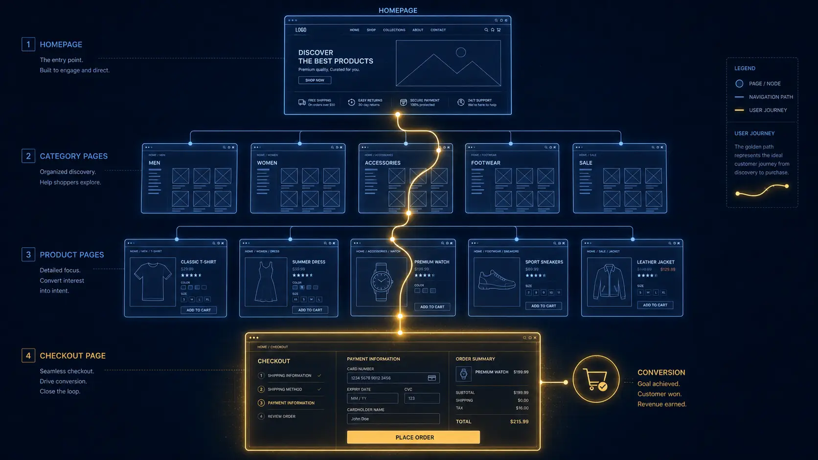
You’ve got traffic. People are landing on your pages, clicking around, maybe even adding things to their cart. And then poof they vanish into the internet ether. If that sounds frustratingly familiar, you need solid website conversion fixes for small business owners who are done watching potential clients walk out the digital door.
Good news: most of the fixes aren’t complicated. They’re just overlooked.
Most small business websites bleed revenue through a few fixable problems: missing CTAs, slow load speeds, friction-heavy checkouts, cluttered landing pages, and zero testing. This guide walks you through the specific fixes that move the needle, backed by data, and won’t require you to hire a developer for six months.
Why Your Website Isn’t Converting (And It’s Not Your Fault)
Here’s a stat that should make you feel simultaneously better and worse:
70% of small business websites lack a call to action, which can directly impact their ability to convert visitors into customers.
So if your site is quietly underperforming, you’re in very crowded company.
Think of your website like a physical shop. Imagine walking in, browsing the shelves, and then… no one is at the register. No signs pointing to checkout. No “Can I help you?” Nothing. You’d leave, right? That’s exactly what your visitors are doing.
The good news is that fixing conversion problems doesn’t always mean a full redesign.
Small, strategic improvements can lead to major conversion gains without increasing your website traffic.
We’re talking about targeted website conversion fixes that work with what you already have.
Fix #1: Kill the Landing Page Friction Points
Your landing page has roughly one job: guide a visitor toward one specific action. But most small business landing pages are trying to do seventeen things at once and doing none of them well.
Friction points like cluttered layouts or vague CTAs cause users to abandon, while a seamless experience drives more conversions by keeping the focus on the goal.
And the goal is always one clear next step.
Here’s what to ruthlessly audit on every landing page:
Your headline.
Data from thousands of A/B tests shows that headline optimization alone delivers a 27–104% conversion lift.
That’s a staggering range and it costs you nothing but a few hours of thought.
Your form fields.
27% of users will bail on a form if it’s too long.
And the fix is simple: form length directly impacts completion rates, reducing form fields from 6 to 3 increases submissions by an average of 25%.
Ask yourself whether you *really* need that fax number field. (Spoiler: you don’t.)
Your message matches.
Conversion increases when a landing page matches what users expect after clicking an ad or link if the ad promises a “free trial,” the page must immediately reflect that offer in the headline and call to action, because aligning content with user intent builds trust and results in more conversions.
Fix #2: Seriously Reduce Your Cart Abandonment Rate
This one’s a gut punch, so brace yourself.
The average cart abandonment rate is 70.22%. Nearly 7 out of every 10 online shopping carts are left behind, signaling friction in the checkout process or decision-making stages.
Seven out of ten. That’s not a leaky funnel that’s a funnel with the bottom missing.
And if your customers are mostly on mobile, it gets worse.
Mobile users have the highest abandonment rates at 75.5%, which is 5.31% higher than the global average.
So why are people leaving?
47% of customers abandon their carts due to extra costs such as shipping, taxes, or fees appearing at checkout.
The lesson here is brutal in its simplicity: surprise charges kill sales. Show all costs upfront. Every time.
To genuinely reduce your cart abandonment rate, focus on checkout UX optimization the experience of *completing* a purchase. That means streamlining the steps, enabling guest checkout, and making it feel effortless.
Consider wallet payment options like Apple Pay and Google Pay, which reduce friction across all devices.
Less typing, more buying.
Fix #3: Prioritize Checkout UX Optimization
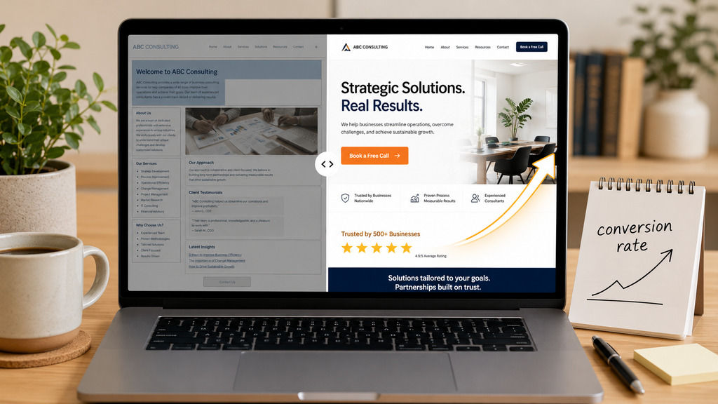
Checkout UX optimization isn’t just about looking pretty, it’s about removing every possible reason for someone to hesitate. Think of the checkout process like merging onto a motorway. Any unexpected obstacle and people slam the brakes.
The fewer barriers a user encounters, the more likely they are to convert a complicated or confusing user journey with too many form fields, unclear navigation, or multiple unnecessary steps can lead to drop-offs and abandoned carts.
For service businesses in particular, the stakes are high.
Adding a phone number as a click-to-call option on mobile pages lifts total conversions by 30–40% for service businesses, a low-effort change with outsized returns.
And don’t forget your trust signals.
Adding reviews, displaying certifications, ensuring your SSL certificate is active, and making contact information visible on every page take minimal effort to implement and deliver immediate credibility gains.
People don’t hand over their credit card details to strangers. Trust signals make you feel like a familiar face.
Fix #4: Speed The Silent Conversion Killer
We live in an impatient world. Here’s the brutal reality: Google reports that 53% of mobile visits abandon pages that take over 3 seconds to load.
Over half your mobile visitors, gone before they even see what you’re offering.
An emphasis on enhancing your website’s speed and performance can lower bounce rates, improve the user experience, and consequently increase conversions.
The quick wins here are real: optimize images, reduce third-party scripts, and ensure your hosting can deliver sub-3-second load times.
And sites that do this well reap measurable rewards.
Google’s Core Web Vitals data consistently shows that sites meeting all three CWV thresholds see roughly 24% lower abandonment than sites that don’t.
Twenty-four percent. That’s not a rounding error, that’s a business outcome.
Fix #5: Use A/B Testing for Local Businesses (Without Losing Your Mind)
I know what you’re thinking: “A/B testing sounds like something a Fortune 500 company does with a team of analysts.” But I promise, it’s far more approachable than that and far more powerful.
A/B testing lets small businesses improve digital marketing decisions across websites, emails, ads, and landing pages even simple website A/B tests show what encourages more clicks, sign-ups, inquiries, or purchases.
The golden rule?
For the best outcome, change just one measurable element of version B each time you run a test.
Test your headline this week. Test your CTA button color next month. One variable, clear results.
For local businesses specifically, some of the highest-impact things to test include: trust signals like reviews, guarantees, and badges (especially “serving [your town] since…”), as well as pricing presentations like starting price vs. tiered packages which helps qualify leads faster.
One important note on patience: small business sites often need to run a test for 2–3 months before the numbers stabilize, so don’t pull the plug after a week of data. That’s like leaving a party ten minutes in and declaring it a flop.
Fix #6: Build in More Trust, Everywhere
Here’s something a lot of small business owners overlook: people convert when they *trust* you. And trust isn’t just about having a good product. It’s about visible signals.
Websites that use video have an average conversion rate of approximately 4.8%, compared to 2.9% without video.
Beyond video, 93% of marketers say personalization increases lead or purchase conversion rates.
Even something as simple as showing locally relevant content or addressing your specific city or neighborhood can make visitors feel like you’re speaking directly to them.
FAQ: Website Conversion Fixes for Small Business
Q: What’s the fastest website conversion fix I can make today?
Add a clear, specific call to action (CTA) above the fold on your homepage. Don’t say “Learn More” say “Book Your Free Consultation” or “Get an Instant Quote.” It takes 20 minutes and can make an immediate difference.
Q: How do I know which landing page friction points are hurting me most?
Start with a heatmap tool like Hotjar or Microsoft Clarity both have free tiers. These tools show you exactly where visitors click, scroll, and drop off, which gives you a data-driven roadmap for what to fix first rather than guessing.
Q: Is A/B testing worth it if I don’t have a huge amount of traffic?
Absolutely.
If your traffic is too low for statistically significant results, test bigger changes like your offer, CTA, or pricing presentation so the difference is easier to detect. You can also use directional learning, treating results as “likely better” rather than permanent truth.
Imperfect data beats no data every time.
Small Fixes, Big Results
Here’s the thing I want you to take away from all of this. You don’t need to rebuild your entire website from scratch. You don’t need a massive ad budget. And you definitely don’t need to panic.
What you need is to look at your website through your customer’s eyes, identify where the friction lives, and chip away at it one fix at a time. Clearer CTAs, faster load speeds, fewer form fields, visible trust signals, and a little disciplined A/B testing will compound into serious conversion improvements over time.
More converting leads means higher revenue without additional marketing costs.
That’s the whole game, right there.
So pick one fix from this list. Just one. Do it this week. Then come back for the next one. Before long, you’ll have a website that doesn’t just attract visitors it turns them into paying clients.
Ready to audit your site? Start with your homepage CTA and your page load speed; they’re the two fastest wins you’ll find. And if you’d like a full conversion checklist or want to dig deeper into any of these fixes, get in touch with us at WebKitty today. I’d love to help.